Shortly after, the child sign’s masthead was updated so all the signage shared a consistent look and feel. The other two playful signs were never created once the decision was made to remove the playfulness in favor of a cohesive look throughout.
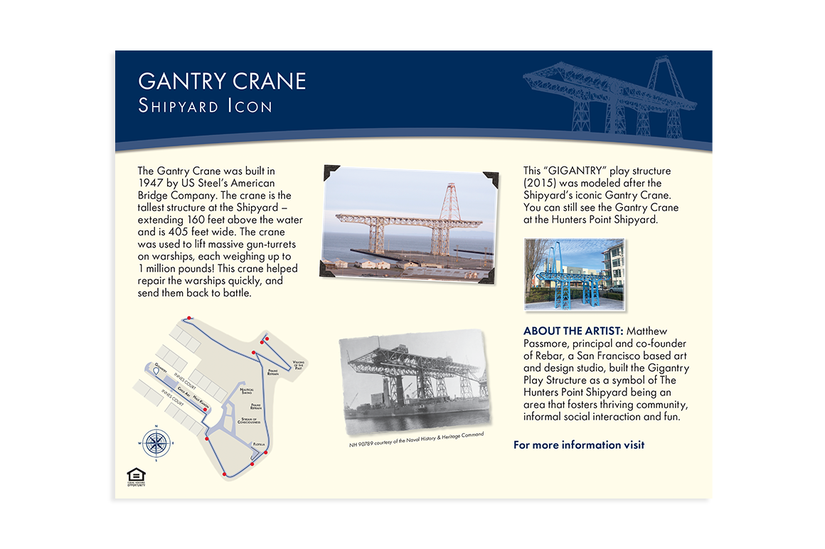
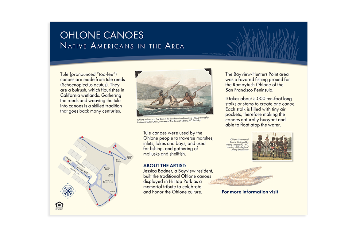
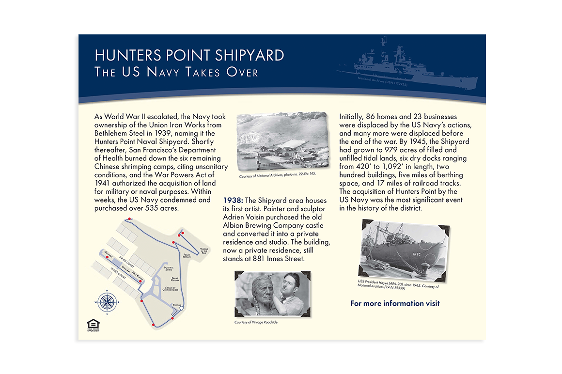
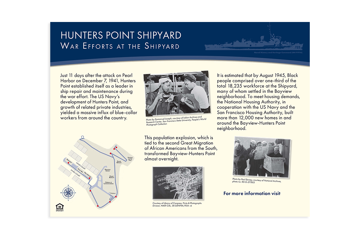
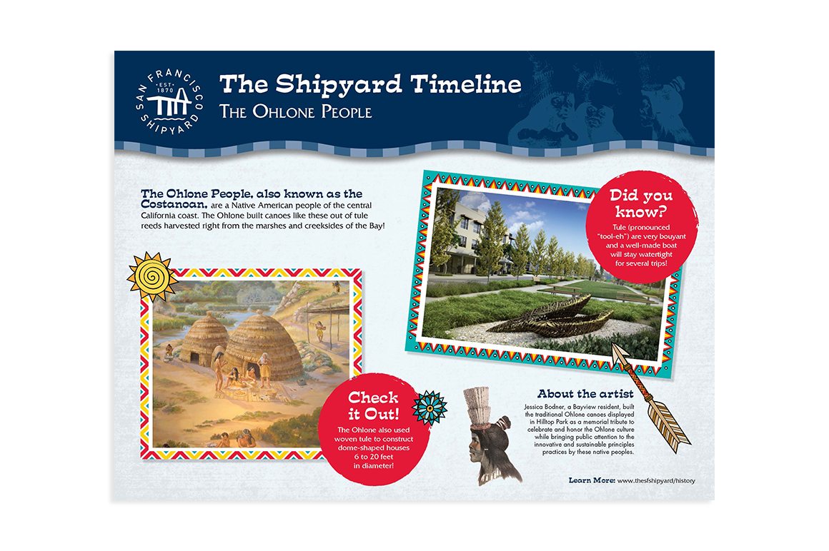
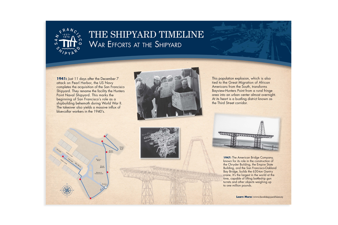
Here are two other signs. All signs have an image with an artistic effect within the blue masthead, a vintage paper background, and a map in the lower left that highlights the sign’s location and helps orient the viewer within the Shipyard.
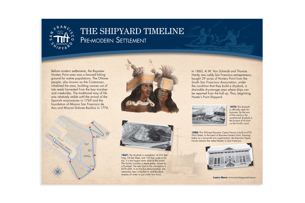
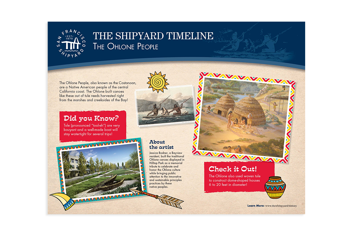
Once the layout phase was complete, the signs were put on hold and remained that way for five years. In 2021, the project resumed, and the signs were redesigned to meet city requirements for the visually impaired. As a result, the signs increased in size, the vintage paper background was removed, colors were adjusted, text was significantly enlarged, and additional layout adjustments were made. During the printing phase, a QR code was added to the right of For more information visit. This project was completed in late summer 2024, and the signs are installed at the Shipyard’s hilltop park. Four of the final signs are below. I will share photos of the installed signage once they become available.